For now we’re using the hammer logo, however Matt Brown who designed the original Hackspace H logo has recently quit Apple and thus can work on a new logo for the HSF. It might just be a better version of the hammer logo for all I know.
He’s asked for inspiration and I’m just going to link him to this thread, so please post things that you think might help with the new design.
With a logo redesign there’s no reason why it cannot be different but with a ‘tip off’ to the current design so it’s recognisable (just look up the evolution of Coca Cola’s logo, Pepsi, and others).
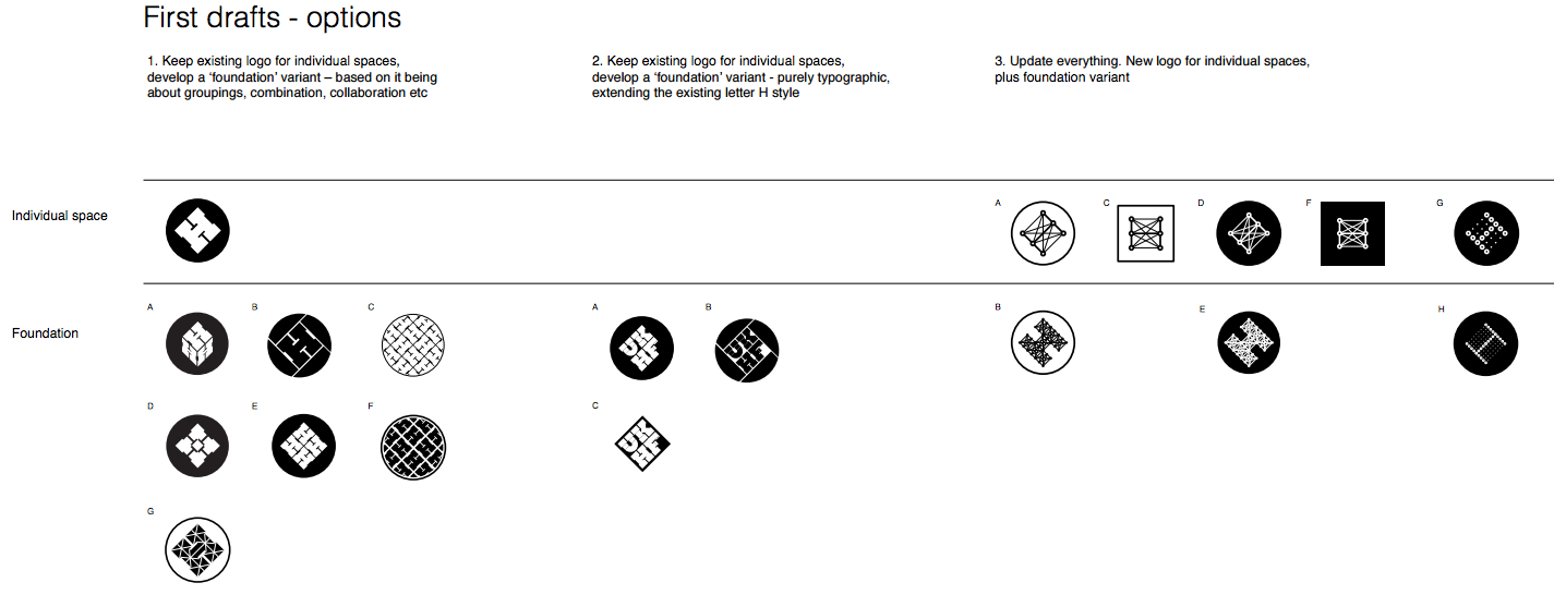
There’s also the idea that we could have variations of the logo for different purposes, some companies choose to retain the ‘same logo regardless’ but this doesn’t help for all scenarios. What if we need a smaller version of the logo when space is constricted (like on a PCB) or what if we need a larger logo, but it doesn’t make sense to only have the icon component and it should have wording or the name with it? This partly comes into a whole ‘brand guidelines’, such as the colour scheme and typefaces and scenarios it’s used in and what it’s used on (eg. print for paper, fabric, can it be etched, CNC routed, etc.)
Some thoughts:
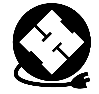
Incorporating DiY tools in some way
Changing how it’s drawn, eg. crayon, laser etched, etc.
Use colours that are ‘printable’ and work in monochrome
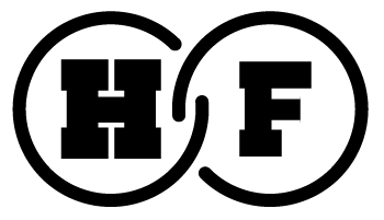
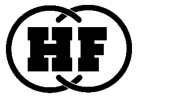
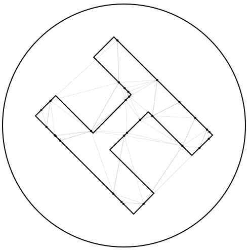
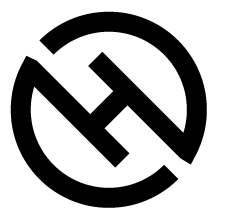
Consider keeping the typeface of the current H but rotate it differently, as its current angle and blocks, combined with the circle have been likened to a swastika
Incorporation of hammers have been likened to communism or communist groups
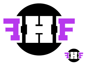
I like the federation ideas too, and that was fed directly back to the designer (along with the network ideas).
The tilt of the logo doesn’t make a huge difference as there’s no obvious “up” direction - traditionally on screens/paper it’s tilted left, but it works in any rotation really.
I specifically asked Matt to iterate on the only designs people liked in telegram, and also to come up with designs around the “network” concept, and also designs that totally break with the existing H logo. He’s very happy about it, which I find baffling.
As soon as I hear back from him I’ll post the next iterations here for discussion.
UPDATE: Matt is stuck on a contract job with little free time at the moment, but he should be able to get the next iteration to us in about a month. He might send over a mid-iteration update so we can all have a nice argument over the work so far, just so we can see progress.
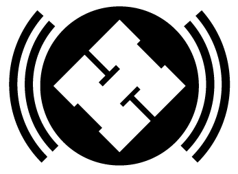
Love the aviation themed one, it’s the best I’ve seen so far IMHO,
including the designer’s ones (but that’s entirely a personal thing).
I do get how people could see it as a bit militaristic or odd due to
mirroring, or maybe even overly steriotypically masculine for the org as a
whole, but I feel it’s strong branding and would look fantastic in a
variety of forms (I’d love an embroidered patch of that for example).
The only potential issue I can see frm my personal view is the white line
width between the Fs and the black circle, but that’s a fairly minor niggle.
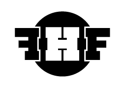
My hack of the logos, this one is my fav’, adjusted the proportions of the F as I don’t have the typeface / it was custom anyway, adjusted the ‘chain links’ to give the letters prominence. Singular use of the letters to represent the name of the ‘brand’.
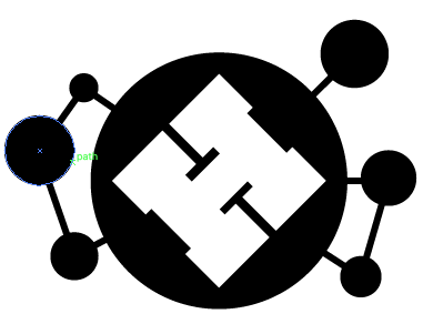
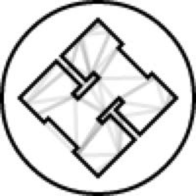
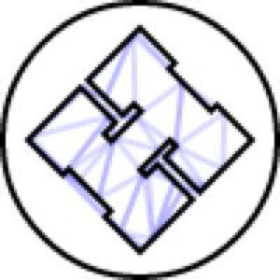
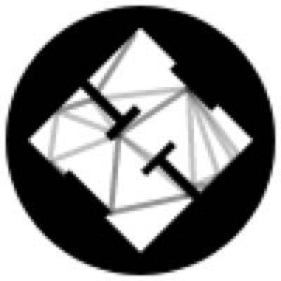
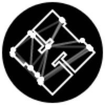
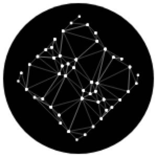
I’ve been working on trying to do the Delaunay Triangluation for real in canvas, the actual aesthetic finish is subject to debate, but I’m working on trying to add a subtle animation to this now.
Gonna keep playing with this because its interesting, but not sure if folks like it in relation to branding, obviously the shape needs to be defined, I’m going to work on an SVG import of the H shape.
@unknowndomain impressive not sure it’d be worth it at small sizes, plus a lot of overhead unless it’s “pre-compiled” into an animated gif. Interested to see how it develops.


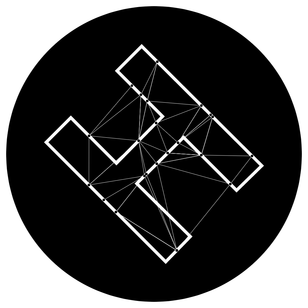
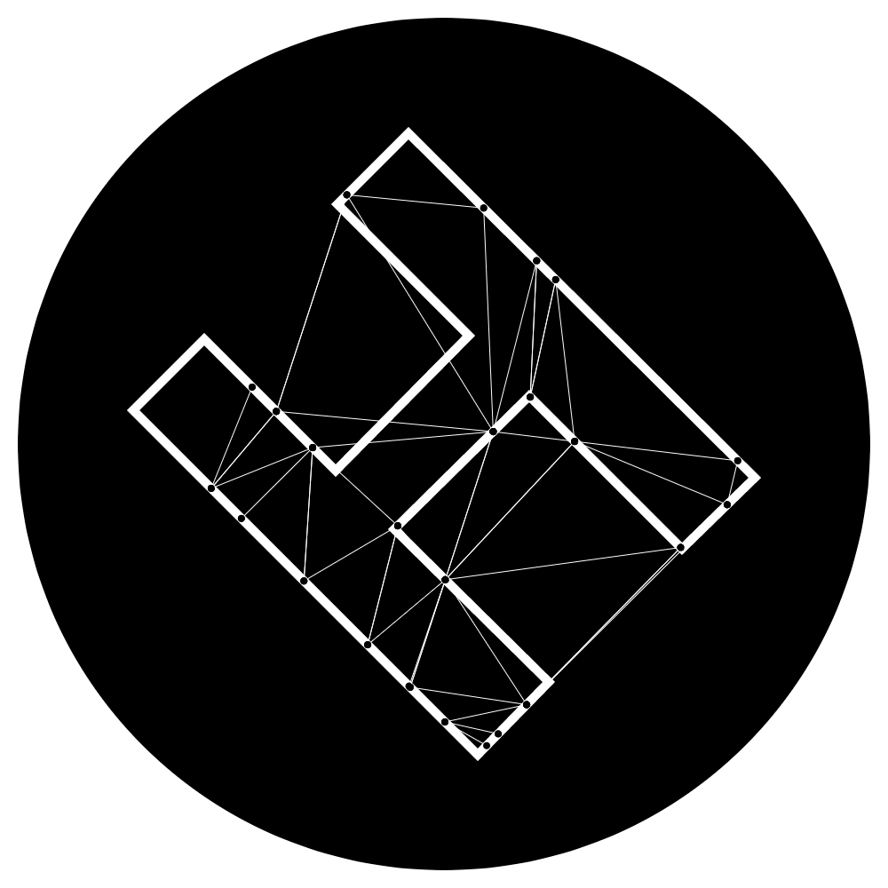
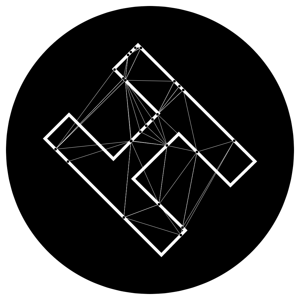


 not sure it’d be worth it at small sizes, plus a lot of overhead unless it’s “pre-compiled” into an animated gif. Interested to see how it develops.