We’re going to ask Matt if he’s happy to do some more work for us. I’m also open to suggestions of designers we can approach - we will (and should) pay.
1 Like
http://bcmh.co.uk/ Would be a suggestion from me.
Have you heard back from him?
Hello!
Yes, he’s keen to do it, but was extremely busy for the last few months. I’ll set up a meeting with him to discuss it.
If anyone is interested we could make it a group call?
Jonty
3 Likes
Hello @jonty, I’m interested. It sounds like another thing to take up your time, feel free to delegate.
Would definately be interested in talking to him with you.
It’s March 2020 and I still dislike our branding, is this a do-ocracy thing? If yes then I’ll just get on and have it changed…appreciate nothing is allowed to change in an even numbered year and all.
edit 1: to take out duplicate word… edit 2: to write that I’d edited
3 Likes
Seems like it should be to me - at least I’d say no harm in contacting some designers (including the ones already mentioned) and getting ideas / costs etc
1 Like
This was waiting on @jonty as per New Hackspace Foundation Branding - which received no response from people to be involved (aside from @unknowndomain) , so presumably the meeting didn’t happen. @jonty didn’t want to offend the current designer, however I think it’s offensive that we’ve been kept waiting if we can move on, so please do.
1 Like
Well, I’ll consider some ways forward.
2 Likes
Yeah, let’s get this logo changed.
If we’re going to do that we need to think about what we want it to communicate?
Right now when you look at it the things you notice in this order:
- H letter - what does that mean?
- Why is it at a 45º angle?
- Green shapes (maybe you read it as a claw hammer head)
- Is it green as in ecofriendly?
- Are the hammers a communist thing?
Overall right now it doesn’t tell you much perhaps:
- that it’s an organisation who’s first letter is H
- that it’s ecofriendly
- you might stretch to DIY, making, or repair through the hammer symbol
But I think it leave an unclear message and theres not a better version of this which reads the full name, the closest is on the home page with the text set in a plain sans-serif typeface:
![]()
If you compare that to the logo we designed for South London Makerspace that others borrowed subsequently:
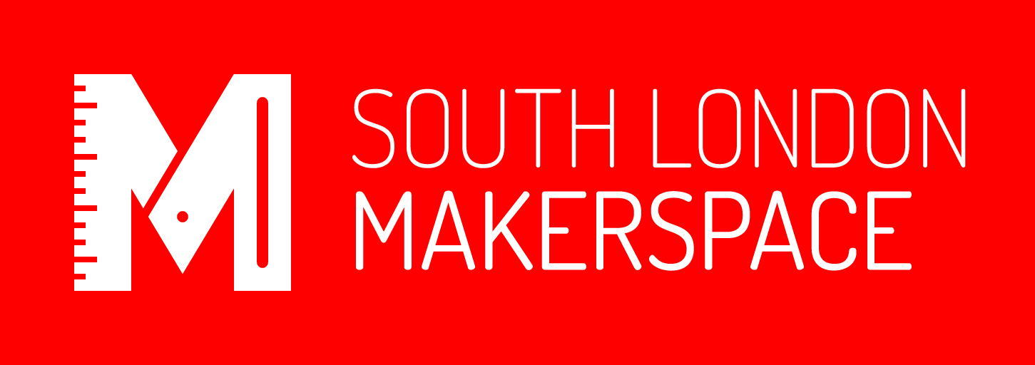
The problem with this logo is similar to the HSF logo it’s contianed in a bounding shape, in the HSF case it’s a circle, in the SLMS case a box which reduces the distinctiveness of the shape, although it does improve the liklihood of it reading on all backgrounds as it creates its own background colour.
The other issue with the full SLMS is the words south london are too thin for reproduction at small sizes.
The icon only version of the logo kind of reinforces the point about the HSF icon we have now, in that the design of the M suggests tools which could more readily lead you to the idea of making and makers.

Being a single colour logo like the original HSF logo used originally by London Hackspace and Nottingham Hackspace (Nottinghack)…


It allows multiple colour ways, at SLMS this was used to indicate Directors (black) and Systems (Blue)…


All this is to say we need to figure out what we want to ask for…
Sounds like you’re asking what the Hackspace Foundation should stand for? Which is its founding principles and representing that in a logo? That’s usually the philosophies behind designing these things.
Unity and support wouldn’t be a bad starting point. South London Makerspace is a great logo, you’ve got the representation of making and measuring in there which implies creation, people are going to make that association.
I think thats what I mean, but maybe more abstractly not what does HSF stand for but what do we want them to think of when they see the mark.
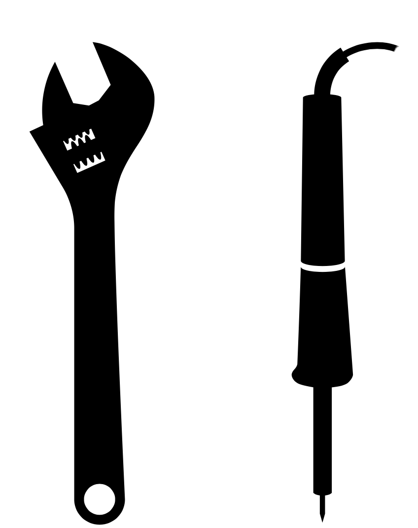
I started making a H but got distracted because I was trying to think of a range of making activities and tools that had identifiable shapes.
1 Like
My attention was drawn to the cog/thread of the adjustable wrench/spanner, that’s usually a symbol of inter-working or working together.
If we decide at least that the ‘shortened’ version should have the letters ‘HSF’ and any long version should say ‘Hackspace Foundation’ then that starts to add constraints on what it needs to look like, too which may help.
2 Likes